Music lovers often find it tough to share their experiences with others in an interesting and east way. Although listening to music alone can be calming and motivating, it can also result in problems like isolation and escapism.
Oxo is designed as an app that not only enables the user to chat with people while playing their favorite music but also lets the user create and join groups while sharing their favorite tunes.
Role and Tools
As this was an individual design dummy project, I was completely in charge of the studies and the design.
Article added on DesignRush
Check out the article about OXO on Design Rush. And read about UX, UI trends and other design related articles on the website
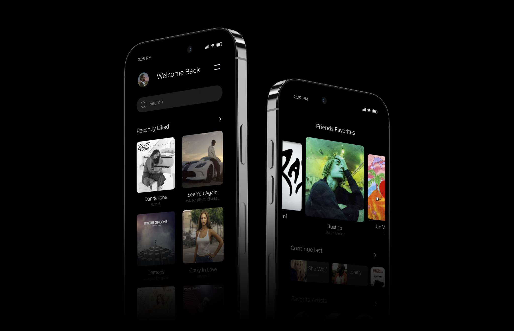
A Home screen with just the right amount of elements added. Very much similar to market apps such as Spotify, yet simplified to likes of the people.
First Look - Home Screen Interface
Multiple UI components and elements combine to form a single screen. The dark theme on the screen provides a visual contrast and enhances the looks of the music covers and artists.
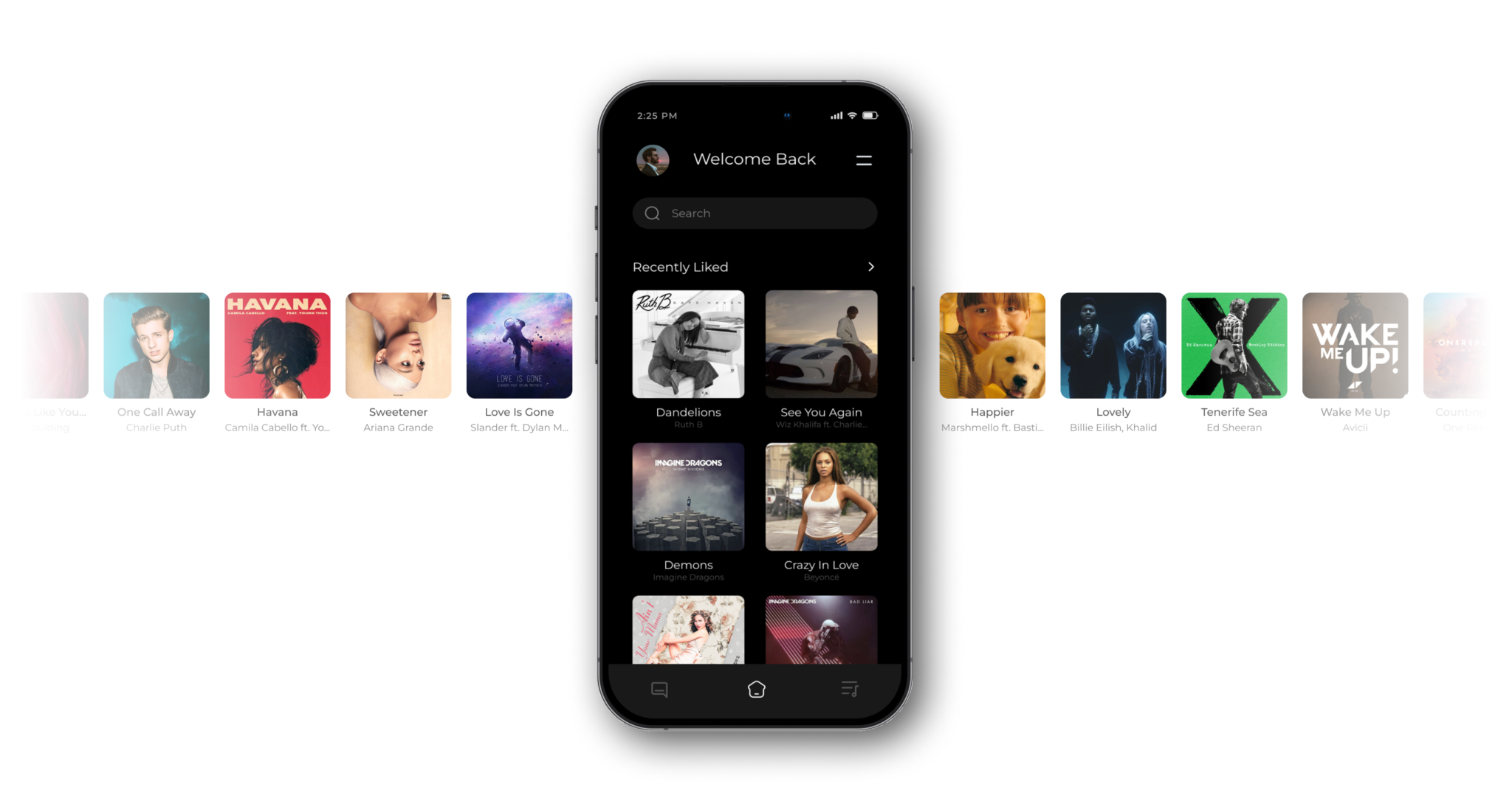
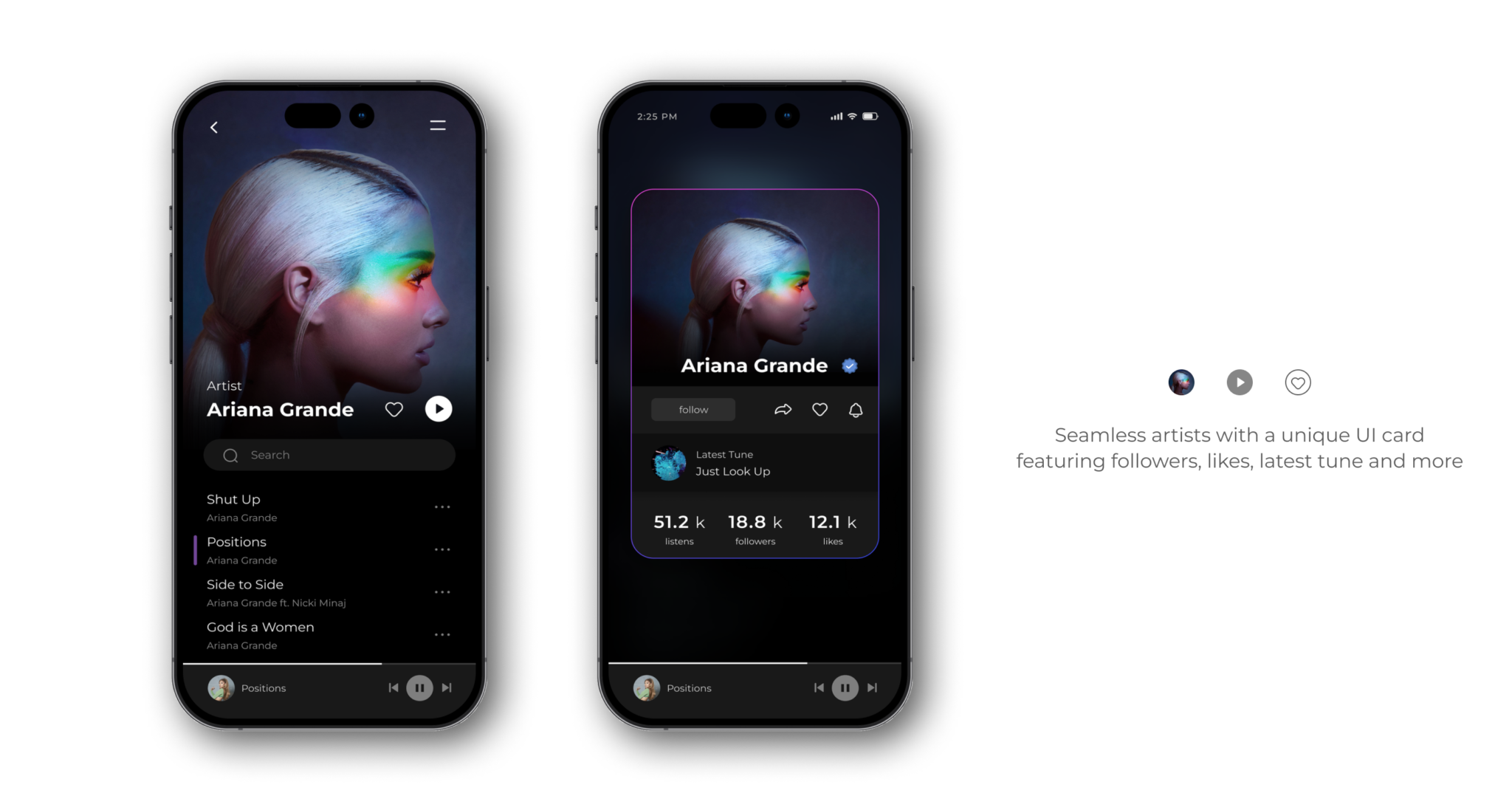
Seamless Artists
The UI of the app lets the artist covers be seamless with a 0px margin since the device itself has a boundary acting as the border
Countless Tunes
Consisting thousands of tunes and hundreds of artists, the screen contains the tunes and music as per the like. Multiple filters and categories sort list the music.
Simple and Efficient Music Player
Keeping things efficient, the interface hides elements in the more section, while only the most used and essential icons are shown to the user
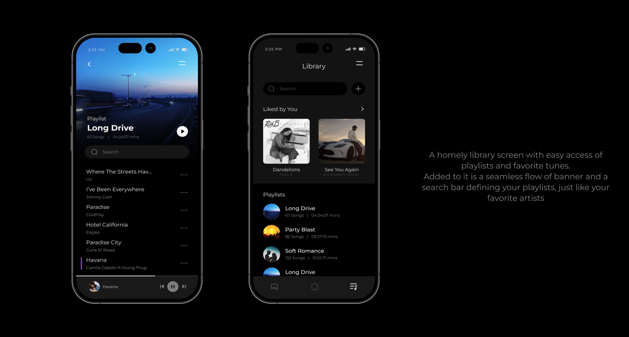
The library
Add the favorites and liked songs in the library with just a click. Make a personalized playlist, find readymade playlists and do more, all in library with ease.
Countless Tunes
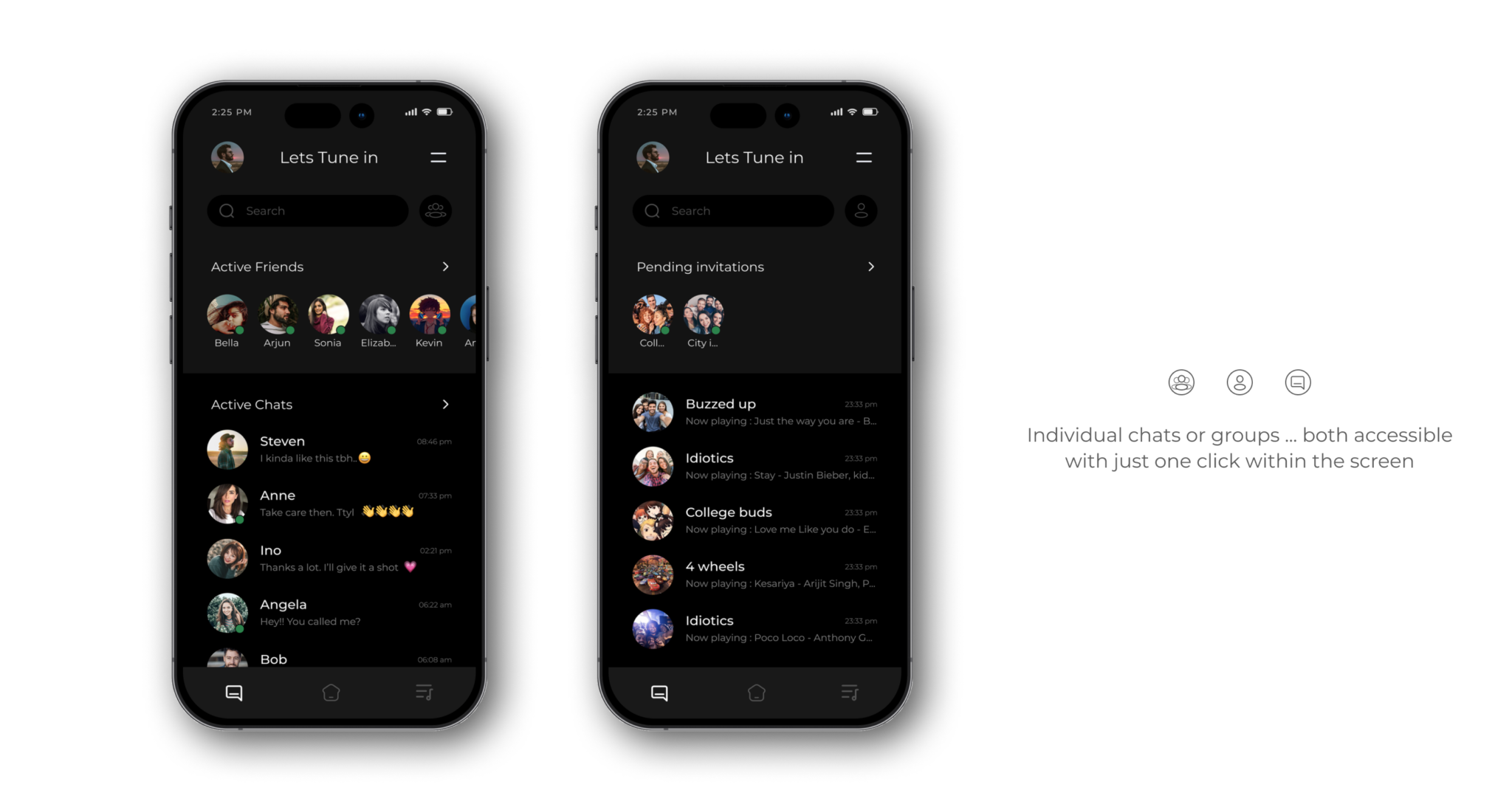
“>Know about your friends and connect with ease. Find the music, tap an icon, and vibe together.
The chat screen defines the USP of the design, and connects people together.
Connect
From the one-on-one chats to forming an entire group of music lovers, the features of this design lets you enjoy your favorite music just the way you like. The screen is divided into 2 which can be changed by just a click letting you access group chats, and individual chats.
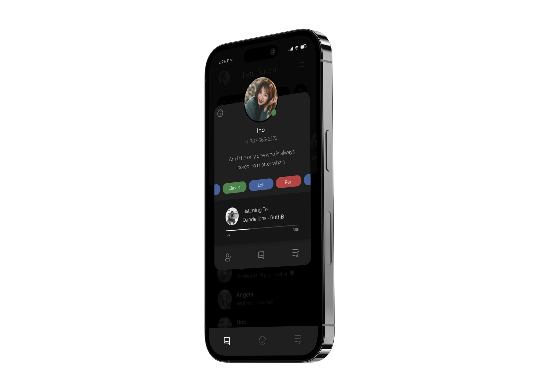
Connecting People
All it takes is to vibe together is to find the music and tap an icon. The app lets you connect with your friends with ease and know about their likes of music all in a UI card.
Simply ... Tune in
The Ui card lets you know about the groups likes and dislikes making it easier to recommend, or pick the song. Chat within the group or with your friend while tuning in to the music of the choice.
Check out a prototype of the designed app and take a walk around.
The Process of Design
Simple scrollable portfolio stands right next to the most used buttons making it easy to like, share or connect with others. Simple screen is maintained to keep things minimal.
Step 1 – Basic Primary research – To understand the topic of what an architecture portfolio is. Step 2 – Understanding the story and actions of the user. Step 3 – Identifying the problem – Area of problem and tip of rough issues. Step 4 – Get a base for primary research. Step 5 – Primary research – Gather insights, possible problems and understand user needs and actions. Step 6 – Ideate – Funnel down to few major and target problems and find a few possible solutions. Step 7 – Prototype – Form a skeleton which includes Wireframes, sketches, flow charts and few basic frames. Step 8 – Testing – Test with users and iterate if needed. Step 9 – Form screens, UI, test and iterate if needed.
For a detail understanding of UX process – Click Here